Thursday, April 28, 2011

Behind the Design (Design 101): Color Harmonies Pt II - Complementary

Ok, so you thought a Monochromatic Color Scheme was easy (and yah, it is). Once you understand the depth and drama that a range of "tints" and "tones" can create (two terms that can play a part in every color harmony... more on that later) you'll never look at a "______ and White" as a color scheme, wedding colors or party decor the same way again. Great! Then you're ready for another popular color combo concept... Complementary Color.

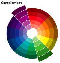
Again, this is such a simple Color Harmony that can so easily go wrong if you don't understand how color really works . So, here's the basics. Selecting a Complementary Color scheme starts, as most do, with a Color Wheel (see below). Start with one color and look directly across the wheel to find the color which is opposite from it and "Voila!" You have your Complementary Colors. Now, if you look around you've probably seen together before. Think about it, right around the Holiday season. Red and Green are directly across from each other on the color wheel. Historically "Purple and Gold" have been used to depict Royalty. Slide slightly over a little more on the wheel and you have "Plum and Sage"... and so on.
Easy right? Ok, now here's were many people go wrong. Most people only look for those "Two Colors" however, they don't consider the multiple tints and tones they could use to create a more polished or professional look. They simply pick the two colors and use them (the exact colors) together throughout the design. Unfortunately, if not done just right the result is a very flat feel.

Unless the design specifically requires a stark, crisp contrast consider using a slight variation of the colors in lighter and darker shades. This will add more visual interest to designs. Let's look at this great example. Look at the tablescape below. It's the old standard of "Red and Green" however, the "Red" takes the form of a tint of "Pink". Also, take a look at the subtle variation in the shades of Green in the Chair cover and the table overlays.


Did you also notice the different tints of pink in the overlay flowers and place setting too? Notice how the layering of colors adds a richer, more lush feel? Remember, it's the same colors just a little darker and lighter. Hope you enjoyed this portion of Behind the Design/Design 101... more Color Harmonies to come.

Thursday, April 14, 2011

Bride's Reception Quesitons: Place Card vs Escort Card

I recently had a consulting session with one of our simply fantastic Brides. She was so excited to chat with me and learn about the many options to choose from for the layout of her up-coming wedding reception. I was later told by her Fiance that "HE" was looking forward to my session with her because I put her mind at ease and she always feels better afterwards. So, what was the big concern? Seating the Guests.


Seating Charts and Place Cards have been a traditional way to direct Guests to where in the reception hall they'll be experiencing the Couple's wedding reception. These "Cards" or Seating Charts can also be helpful to Catering Staff when identifying and serving Guests with specific dinning needs. For example; perhaps a Guest has dietary restrictions or you are having a Plated Dinner where Guests have selected a particular meal like Chicken or Fish.
This topic can be a tricky one for some Brides & Grooms. After all, there's a lot of family members and friends (and of course their personalities) to keep in mind. Who should sit with whom? Should you encourage new family members to meet? Should you sit friends who know each other together? And you know Cousin Pat doesn't get along with Aunt Betty... where should they sit? Then once you've decided which 8 to 10 people will sit at which table, then comes the detail of deciding exactly where they sit and next to who? Decisions, decisions, decisions.
Brides can refer to the guidance of their Planner or use other planning aids to assist in the logistics of these tasks. In the past few years many couples have also embraced the options of Escort Cards. While both Place Cards and Escort Cards feature the name of Guests they each have slightly difference purposes and benefits. Which one may work best for you? Compare the differences between the two:
Place Cards: Usually a small card (sometimes held in a decorative holder) with an individual Guest's name placed at the place setting at the Guest's table. Place Cards convey a formal element. Guests often feel as if the Host (Bride and Groom) have thought specifically about them - as if it's like a personal "Welcome, please have a seat".
Escort Cards: This is a little more informal yet still a delightful way to convey a scene of elegance. Cards that identify a Guest's Name and their table are displayed before the Guests enter the reception hall. Guests then find their card and carry it with them to their table. Guests then seat themselves where they feel comfortable at the table. A benefit of Escort Cards will be the reduced step of determining exactly who sits next to whom while still insuring that the right Guests sit together. It also offers another design option for the look of the wedding. Many Brides and Event Designers take advantage of creating an additional focal point out of where the Escort Cards are displayed.
Consider the look, the feeling and style of your wedding when choosing how to seat your Guests.